Your menu is not a place to show how creative you are. It is a promise: “The thing you came for is here.” When that promise is hard to understand, visitors leave or start guessing.
The fix begins before you draw a header. Make a short list of the tasks people arrive to complete, then build the navigation around those tasks.
Start with the visitor's route
Write down the top five questions a first-time visitor brings. A local service buyer might ask what you do, whether you work nearby, what the process costs, whether you have proof, and how to contact you. A shopper asks where the right product is, whether it fits, when it arrives, and how returns work.
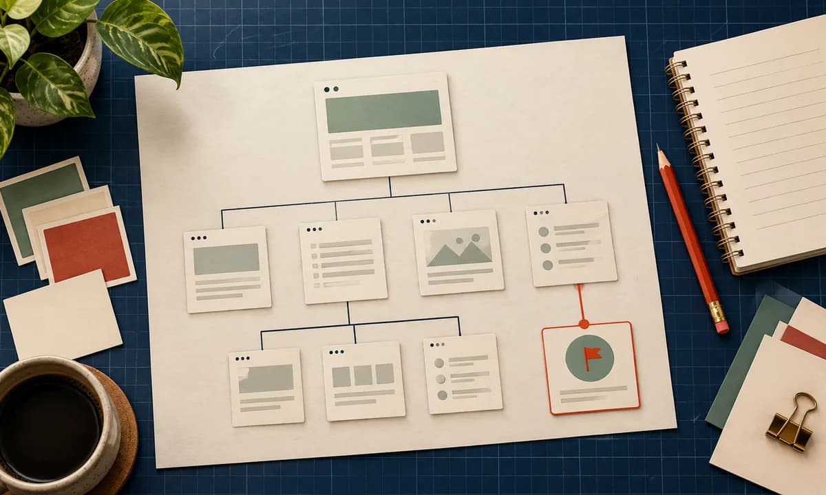
Turn those questions into a page map. Our first website planning guide shows how to do it before choosing a template. Do not give every possible page a top-level menu item. Group related pages under labels users already know: Services, Products, About, Resources, Contact.
The point is not to copy a universal five-item menu. It is to put the most valuable routes where people can predict them. A small site might need four items. A large catalog might need categories and filters. Both need labels that match the audience's vocabulary.
Use evidence, not a clever label
In Baymard Institute's 2026 benchmark of more than 180 leading ecommerce sites, 61% of desktop sites and 65% of mobile sites had mediocre-to-poor homepage and category navigation performance. This is a benchmark of ecommerce experiences, not a statistic for every small business site. It shows how much room there is to improve basic wayfinding even on well-funded sites.
Try a five-second label test. Show a person the menu without explaining the site. Ask where they would click to find delivery information or request a quote. If “Our Magic” requires an explanation but “Services” does not, the decision is made.
Link text inside pages matters too. WebAIM's 2026 review of one million home pages found ambiguous text such as “click here” on 15.2% of pages. “View delivery and returns” works better for scanning, screen readers, and a visitor who opened several tabs. The W3C accessibility guidance also expects link purpose to be understandable from its text or context.
Treat mobile as a separate test, not a smaller screenshot
On a phone, the menu competes with limited space and a thumb. Keep the trigger visible, give it an accessible name, make tap targets comfortable, and ensure the menu opens, closes, and works from a keyboard. Put the most important action in a predictable place. Avoid nesting three levels of categories if a landing page with clear subcategories will do.
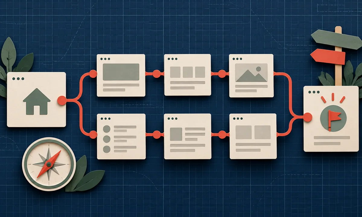
For stores, let categories reflect how customers shop. “Men,” “Women,” and “Accessories” may be enough for one catalog; another needs product type, use case, or size. Connect the category route to a useful product page, then make the route to checkout clear. Navigation is a journey, not just a header.
Run a small task test
Give three to five people a task: “Find the price of X,” “Find whether this ships to Abuja,” or “Book a call.” Do not tell them where to click. Watch the first click, backtracking, and words they expect to see. Record the task and whether it was completed; fix the repeated failures first.
Then run the same tasks on a phone. Check the footer, breadcrumbs, in-page links, and search as well as the main menu. If visitors can only find an answer by using search, the page map may need work.
Finally, review analytics for popular pages with exits or repeated internal searches. Those are clues, not proof of a bad menu. Pair them with observed user sessions or direct feedback before changing the structure.
Document the final navigation rules for the team. Say which pages qualify for the main menu, where new resources belong, who approves label changes, and how redirects will work when a page moves. Without ownership, every new campaign asks for its own top-level item. Six months later the menu becomes a record of internal politics rather than a guide for customers.
A good navigation system feels almost boring. People arrive, recognize the next step, and move. That is exactly the job.