
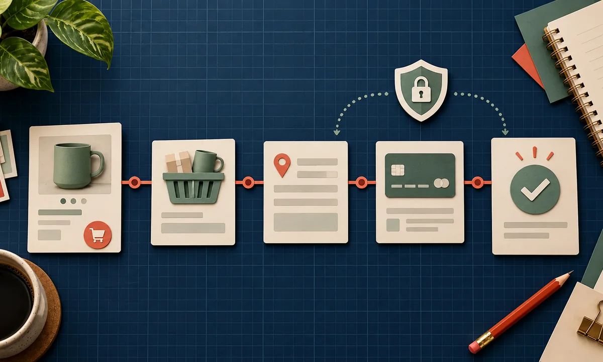
Most store teams spend weeks arguing about the homepage and an afternoon deciding how payment works. That order is backwards. Checkout is where a buying decision becomes an order, and every unclear step gives the customer another reason to stop.
Sketch the path on paper before writing custom code.
Put the abandonment number in context
Baymard Institute's cart-abandonment tracker averages 50 studies and reports 70.22% cart abandonment. That does not mean seven in ten buyers were ready to purchase and your checkout lost them; Baymard notes that browsing and comparison explain part of the total.
The useful numbers are the solvable reasons. Among surveyed shoppers who abandoned for reasons other than “just browsing,” Baymard reports 40% citing extra costs, 19% citing lack of trust with card information, 18% citing forced account creation, and 17% citing a long or complicated checkout. The groups overlap, and these are reported reasons, not an experiment proving how much one change will lift your conversion rate.
Use them as prompts for a design review, not as a forecast.
Draw the whole journey
Start on a real product page. Draw each state: product selection, cart, address, delivery, payment, confirmation, and follow-up. Add alternate paths: discount code fails, stock changes, payment is declined, the customer returns after leaving, and the connection drops after payment authorization.
For each screen, write the question a customer is trying to answer. In the cart: “What will I pay?” At delivery: “When will it arrive?” At payment: “Is this safe?” At confirmation: “Did my order go through?” A form field or design element belongs only if it helps answer a question or complete the transaction.
This is the same discipline as planning a first website, but the consequences of a dead end are immediate. A custom store gives you flexibility; it also makes you responsible for every edge case a hosted platform would normally handle.
Reduce work without hiding important choices
Show the full price early, including delivery and tax where they can be calculated. Offer guest checkout unless there is a compelling legal or operational reason not to. Ask only for information required to fulfill the order. Let browsers autofill standard fields and preserve entered information after validation errors.
Baymard's checkout usability analysis says an ideal flow can have 12–14 form elements, while its benchmark of US sites found 23.48 elements displayed by default on average. The right number for your store depends on products, delivery rules, and payment requirements. The point is to justify each field rather than copy a long default form.
Make payment methods fit the market. Test the options your customers actually use, including mobile wallets or local payment rails where relevant. Keep security claims accurate and show recognizable payment steps without adding fake trust badges.
Treat failures as product states
The “happy path” is only one scenario. Decide what happens after a timeout, duplicate click, failed authorization, inventory race, or webhook delay. The buyer must not be charged twice because a button was pressed twice. An order should not appear complete merely because a browser landed on a thank-you URL.
Create a test matrix with columns for scenario, expected message, order state, payment state, notification, and recovery action. Rehearse it on a phone. Ask one person who has never seen the design to buy a low-cost test item and explain the total before paying.
Keep privacy and accessibility in the review. Form errors need visible text and focus, not color alone; the W3C WCAG reference covers labels, error identification, and keyboard operation.
Measure a funnel you can improve
Track product view, add to cart, checkout start, delivery selection, payment attempt, and confirmed order. Use the same order ID across analytics and backend events, but keep sensitive payment details out of analytics. Compare drop-off by device, payment method, and shipping option. Review session evidence or customer feedback before guessing at the cause.
If a simple catalog does not need custom checkout behavior, evaluate a hosted route such as Shopify or WordPress ecommerce. If you do need custom, earn it with a documented journey, test cases, and an owner for the post-launch funnel.
Keep a written rollback plan for payment changes. A checkout experiment is not worth running if an error leaves orders in an unknown state.